
























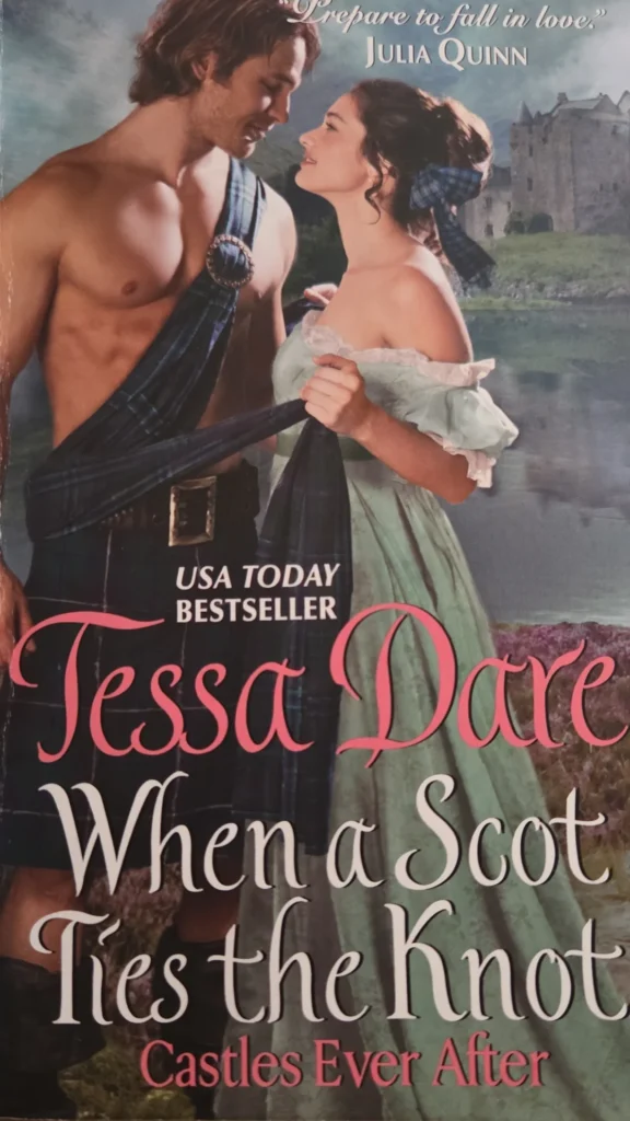
The standard formula for romance novel covers was ripped, bare-chested men and dramatic embraces set against stormy skies.
For years, loving romance novels required a certain level of tactical stealth.
As someone who has spent countless hours devouring them, I always found the contrast fascinating. The stories were thoughtful, emotionally rich, and often beautifully written. The covers, however, seemed determined to advertise something entirely different.
The standard formula for romance novel covers was unapologetically loud: ripped, bare-chested men and dramatic embraces set against stormy skies. It was an aesthetic that dominated bookshop shelves for decades and shaped how the genre was viewed long before anyone reached the first page.
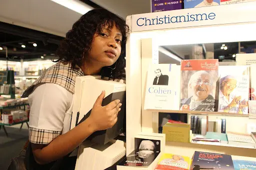
For readers, buying these books often required nerves of steel. So it’s no surprise that those famous romance novel covers became synonymous with improvised book jackets.
Looking back, that disconnect says more about the publishing industry than it does about romance readers. The novels themselves explored love, grief, healing, friendship, family, and personal growth. Yet, the packaging reduced all of that complexity to a single dramatic embrace.
Thankfully, that visual language did not last forever.
To understand how dramatically the genre has changed, it helps to revisit the decade that cemented its visual identity.
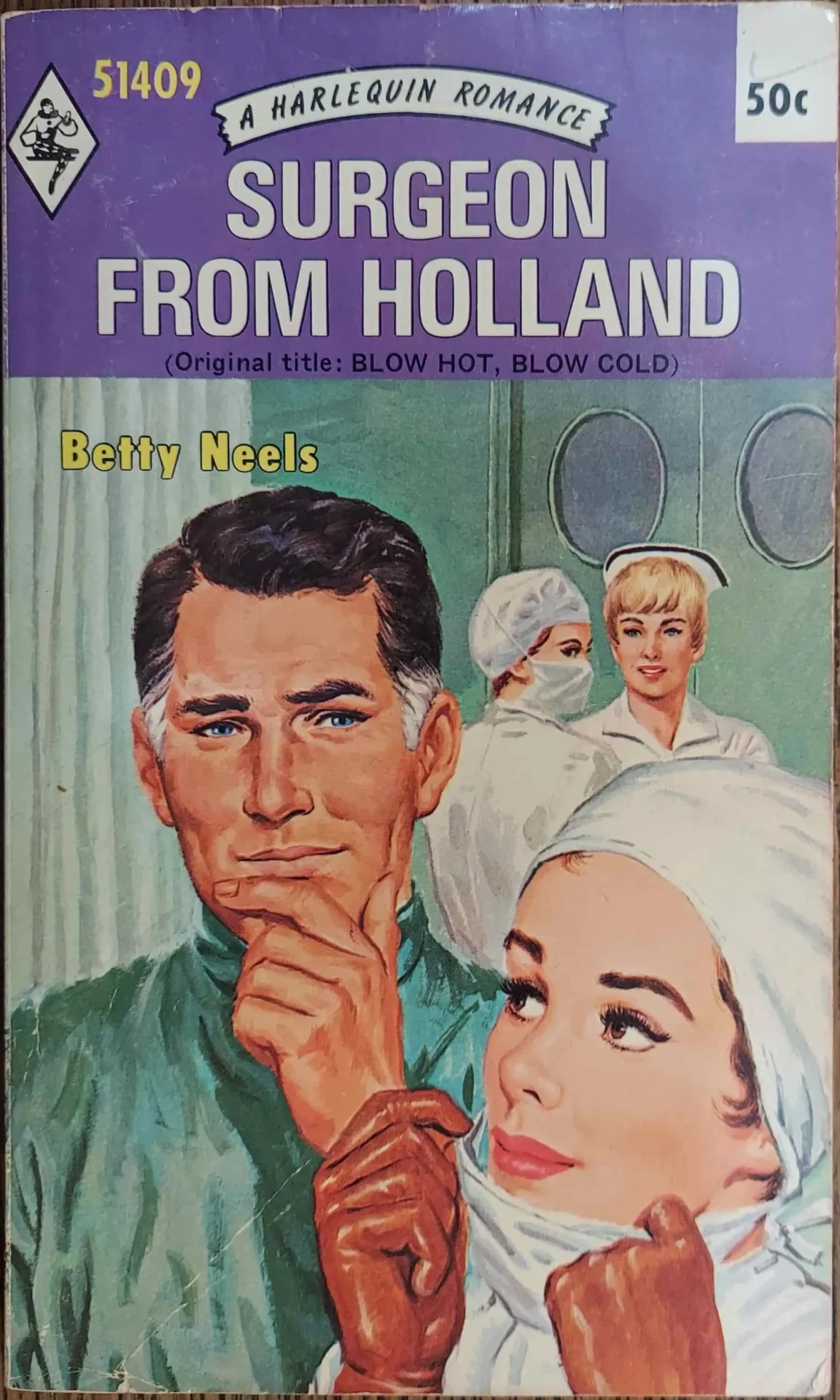
Throughout the 1980s, the “clinch” cover became almost inseparable from romance publishing. It was the age of Fabio and the impossibly perfect hero, where exaggerated passion was considered the quickest route to a reader’s attention.
Everything from the oil-painted backgrounds and barely covered characters was designed to be as deafening as possible. Subtlety was simply never part of the plan.
In fairness, those covers suited the market they were created for. Romance novels competed for attention on supermarket shelves, airport book displays, and pharmacy racks before online shopping existed. A quiet design simply would not have stood out enough to attract buyers’ attention.
Today, many of those illustrations carry a certain nostalgic charm. They have become instantly recognisable symbols of an era when romance embraced spectacle without apology.
Yet, they also created a stereotype. Ask anyone to picture an old romance novel, and chances are they will imagine a shirtless hero before they remember the stories themselves.
By the early 2000s, publishers recognised that the classic painted clinch was beginning to look dated. Rather than abandoning it altogether, they tried to modernise it.
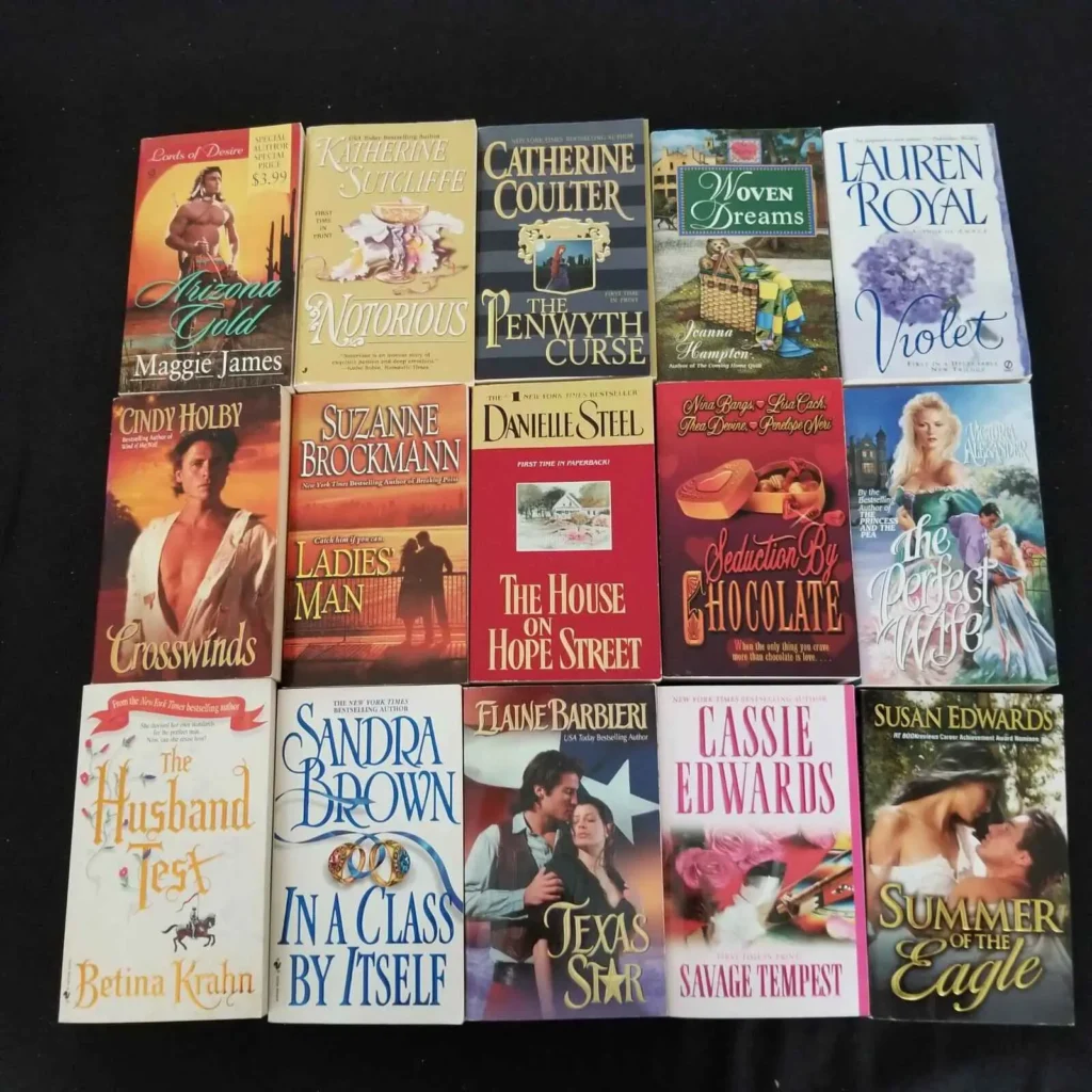
Photography replaced many oil paintings, giving romance novel covers a sleeker, glossier look. The heroes still lacked complete clothing, but the styling felt more contemporary, with sharper lighting, polished photography, and embossed metallic lettering replacing the softer painted aesthetic.
This period also popularised the clever “stepback” cover. The outer jacket often displayed an elegant image such as a rose, a grand house, or a solitary heroine. Open the cover, however, and readers were greeted by a hidden clinch illustration inside.
Looking back, the step back feels like a quiet acknowledgement that something had changed. Publishers still believed passionate imagery sold books, but they also recognised that many readers preferred a little privacy while carrying books on trains, buses, or into waiting rooms.
The turning point did not happen overnight, but once it arrived, it completely reshaped how romance was presented.
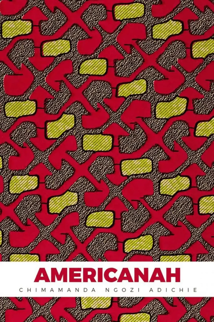
Driven by a perfect storm of change, it followed the rise of digital publishing, the popularity of e-readers, shifting reader expectations, and a generation that viewed the old clinch covers as more dated than romantic.
For years, publishers had focused on updating the traditional formula. By the mid-2010s, they were asking a far more interesting question: did every romance novel still need to look like one?
The answer cannot be limited to “no”. It marked the moment romance publishing stopped defending itself and started embracing what the genre had always been.
Readers were no longer discovering books only on supermarket shelves. Online bookshops displayed covers as tiny thumbnails, where bold colours and clean design often stood out better than detailed paintings.
At the same time, publishers realised the old aesthetic had become a barrier for people who had dismissed romance without ever reading it. Changing the covers became a way of changing that first impression.
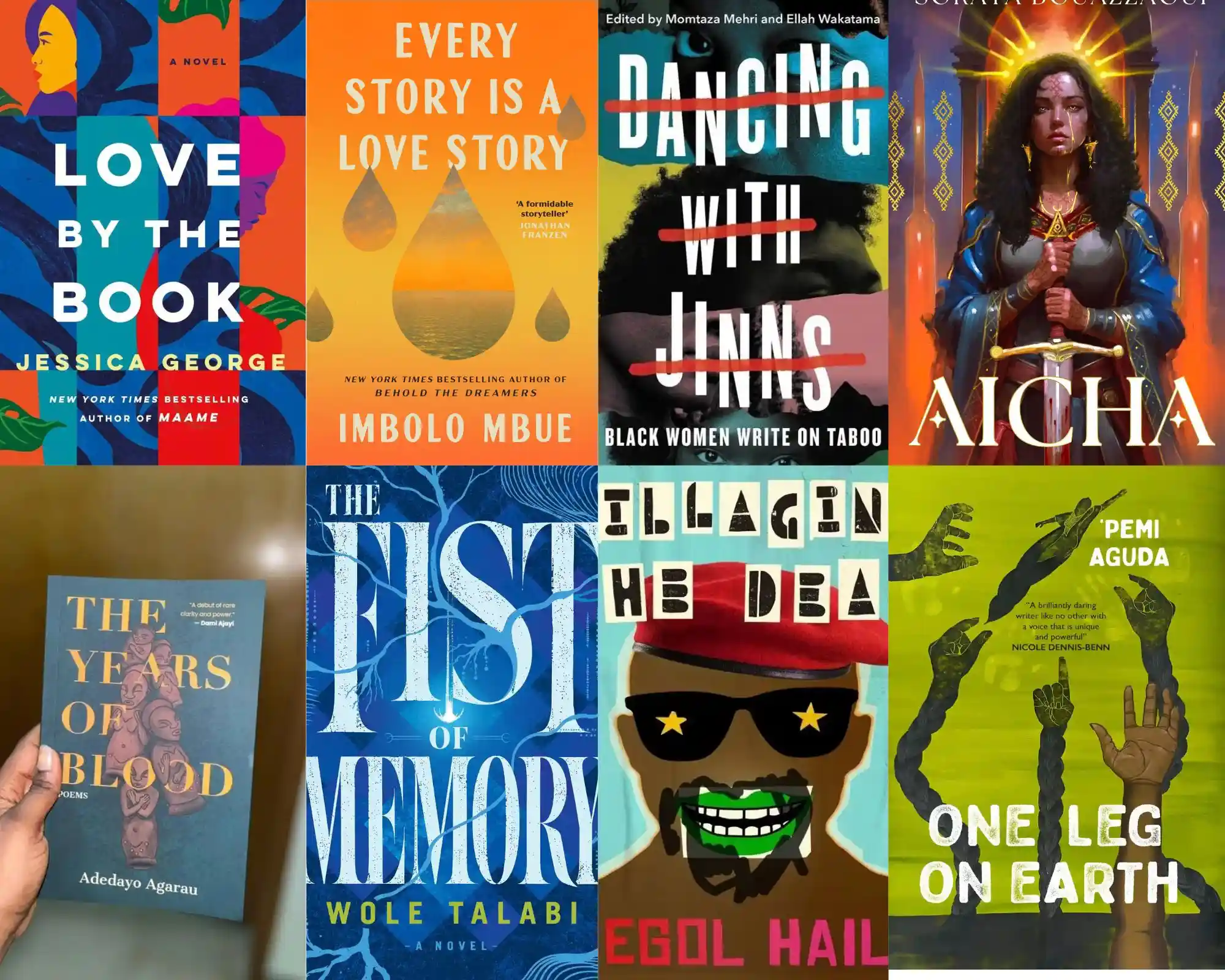
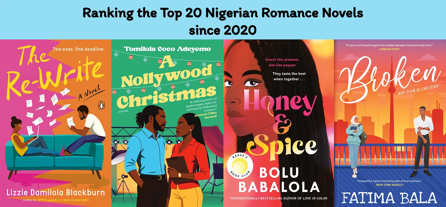
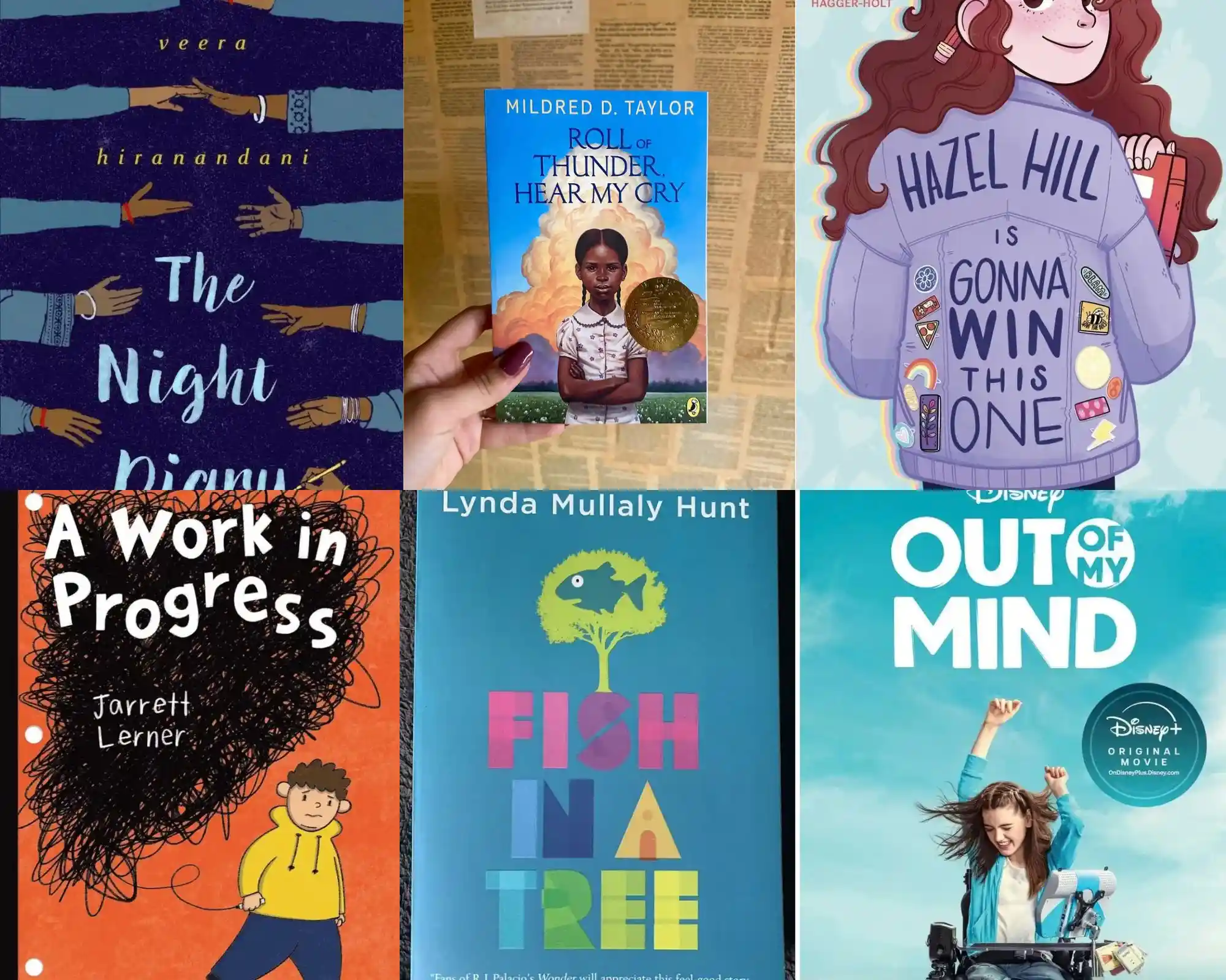
The breakthrough came with bright, illustrated romance novel covers that favoured expressive colours, memorable typography, and playful character art over dramatic embraces.
Of course, the illustrated trend eventually developed its own familiar look. Walk into any bookshop today, and pastel colours, cartoon couples, and oversized lettering appear again and again. Even so, that feels like a far healthier problem to have.
Romance is no longer trying to escape old stereotypes. Instead, it is figuring out how to represent the remarkable range it has always contained.
Typeface stopped being an afterthought and became a tool for storytelling and features that can communicate mood.
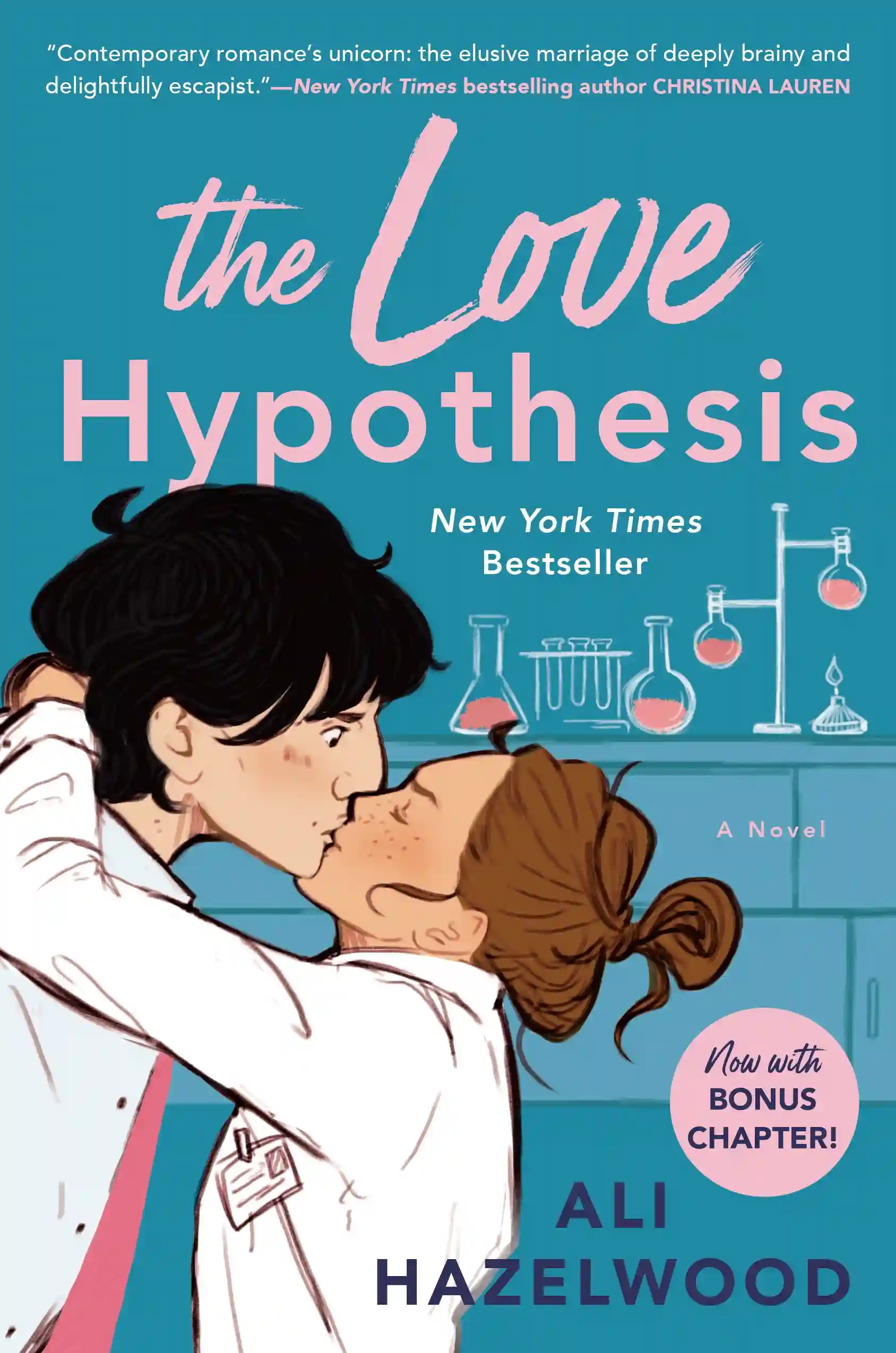
Light-hearted contemporary romances often lean on chunky serif fonts, handwritten lettering, or playful typefaces that immediately suggest warmth, humour, and optimism. Without revealing anything about the plot, the cover already hints that the story will probably leave readers smiling.
Historical romances and emotionally heavier love stories usually take the opposite approach. Elegant serif fonts, restrained layouts, and generous spacing create an entirely different atmosphere. The effect is quieter but no less romantic.
That shift fascinates me because it says so much about how the genre has matured. Today’s designs rely on mood, symbolism, and thoughtful design to spark curiosity.
In addition, a reader can often recognise whether a novel is funny, heartbreaking, historical, paranormal, or suspenseful before reading a single sentence.
As illustrated covers became more common, another shift quietly took place. Lism helped the romance genre move further into the mainstream; it also created a new challenge. If every cover featured cheerful artwork and pastel colours, how could readers tell the difference between a sweet romantic comedy and a novel filled with explicit scenes?
The answer was not to abandon the new aesthetic. It was to refine it.
Rather than treating romance as a single category, romance novel covers began reflecting the genre’s incredible variety. Instead of simply announcing, “This is a romance,” they started answering a far more useful question: What kind of romance is this?
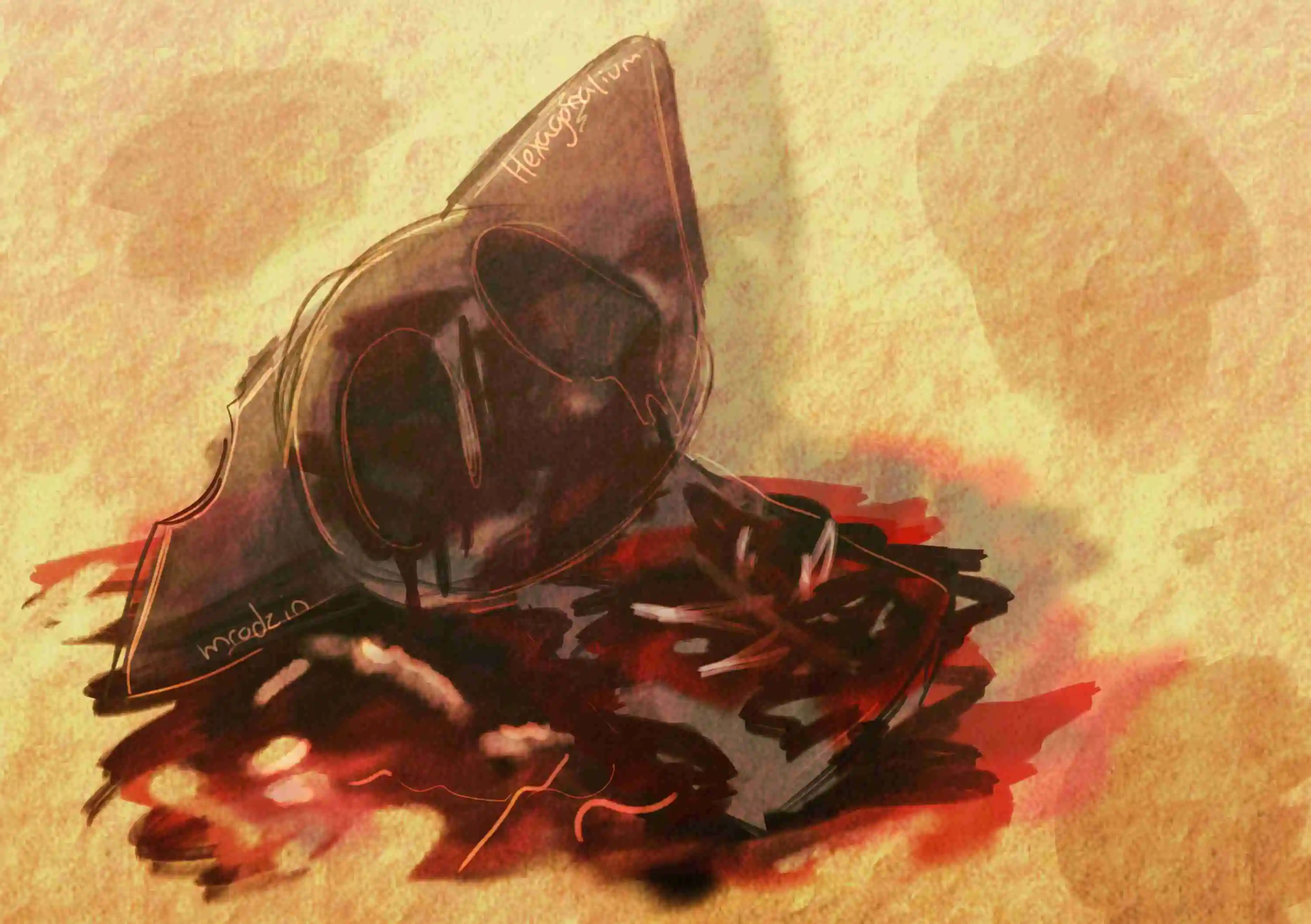
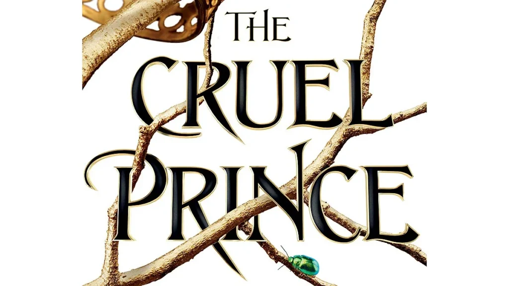
Darker subgenres such as gothic romance, paranormal romance, mafia romance, and dark romance moved away from playful illustrations and embraced mood-driven design.
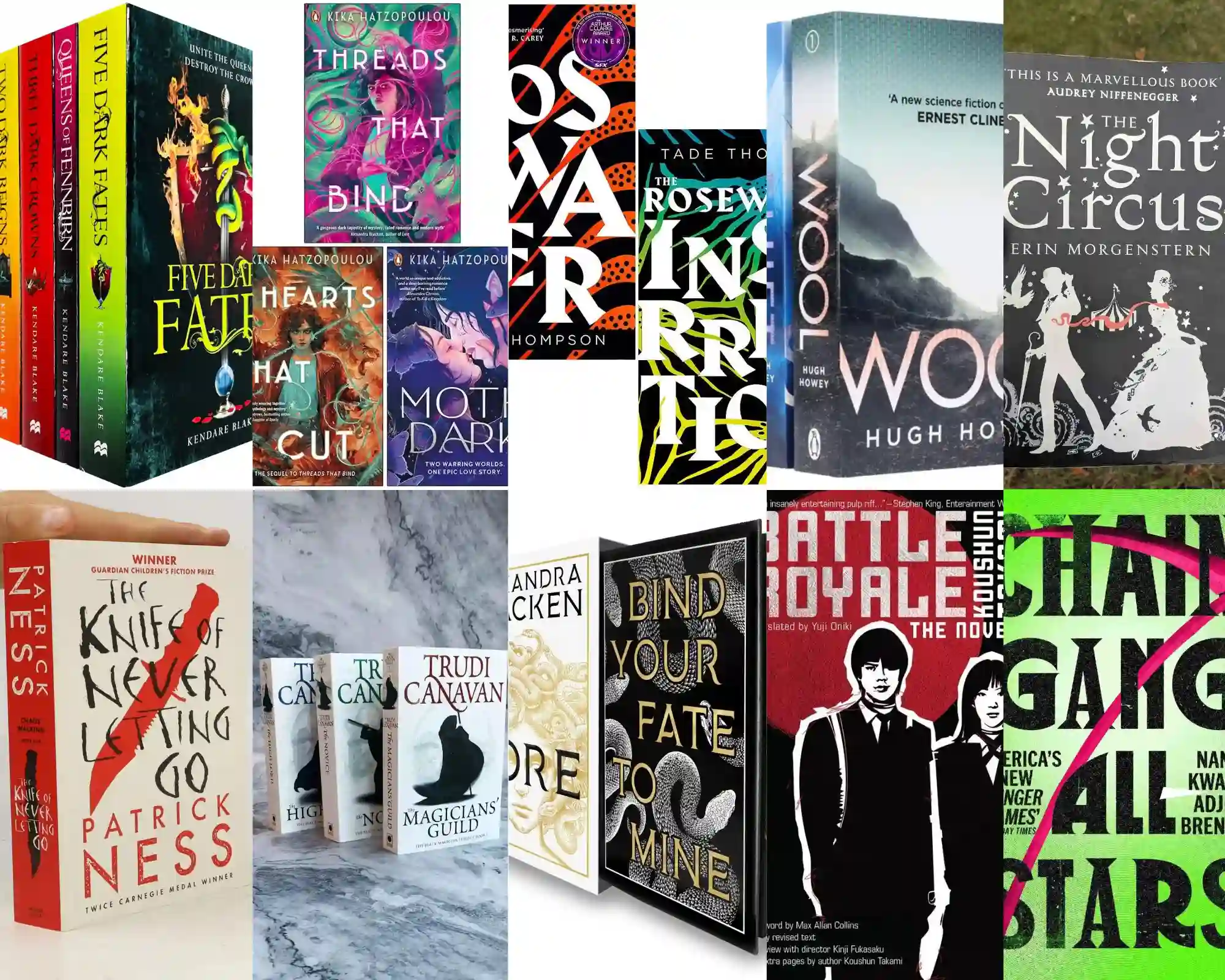
Deep blacks, rich reds, metallic foils, shattered glass, snakes, daggers, crowns, ravens, and wilted roses became visual shorthand for obsession, danger, grief, and morally grey characters. Instead of placing the couple front and centre, these covers created an atmosphere that hinted at the story waiting inside.
I find that far more interesting than the old formula. It asks readers to engage with the novel’s tone rather than rely on familiar clichés to convey romance.
Perhaps the biggest surprise is that some of today’s steamiest romance novels have the most understated covers. That restraint feels like the final proof of how far the genre has come: romance no longer needs to announce itself loudly to be understood. Instead, the cover can simply hint, and the reader can do the rest.
Books packed with explicit scenes may feature nothing more than elegant typography, a floral illustration, or a minimalist design. To anyone unfamiliar with the genre, they look like contemporary literary fiction. Romance readers, however, have become remarkably adept at interpreting visual cues.
That feels like another sign of the genre’s growing confidence. Sexuality has simply stopped being the only thing the romance novel covers communicate.
Looking at bookshelves today, the evolution of romance novel covers feels less like a corporate marketing shift and more like a hard-won cultural victory.
We have moved from an era of apology to an era of absolute pride. The modern cover does not attempt to disguise or diminish the value of a love story; it celebrates it with artistic integrity.
By embracing diverse, sophisticated, and boundary-pushing designs, the publishing world has finally validated what readers knew all along: that stories about human connection, intimacy, and joy deserve a beautiful, unhidden place on our shelves.
 Best Films About Unexpected Age Gap Romance
Literary Awards and the Racism Card: A Wake-Up Call for Black Africa
Interview with the Vampire Relationships, Ranked
10 Top Recent Films for Action and Comedy Fans
Comma Rules Every Writer Should Know
10 Most Hype-worthy 2026 Book Releases (African Literature Version)
Five Gambling Films That Know the Bet Is Only Half the Story
Movies Where Poker Reveals Who a Character Really Is
Ranking the Top 20 Nigerian Romance Novels since 2020
In Defense of Reading and Gaming
8 Third-Person Omniscient Examples for the Plot
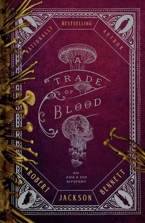
A Trade of Blood (Ana and Din Mysteries #3) by Robert Jackson Bennett
Best Films About Unexpected Age Gap Romance
Literary Awards and the Racism Card: A Wake-Up Call for Black Africa
Interview with the Vampire Relationships, Ranked
10 Top Recent Films for Action and Comedy Fans
Comma Rules Every Writer Should Know
10 Most Hype-worthy 2026 Book Releases (African Literature Version)
Five Gambling Films That Know the Bet Is Only Half the Story
Movies Where Poker Reveals Who a Character Really Is
Ranking the Top 20 Nigerian Romance Novels since 2020
In Defense of Reading and Gaming
8 Third-Person Omniscient Examples for the Plot
A Trade of Blood (Ana and Din Mysteries #3) by Robert Jackson Bennett
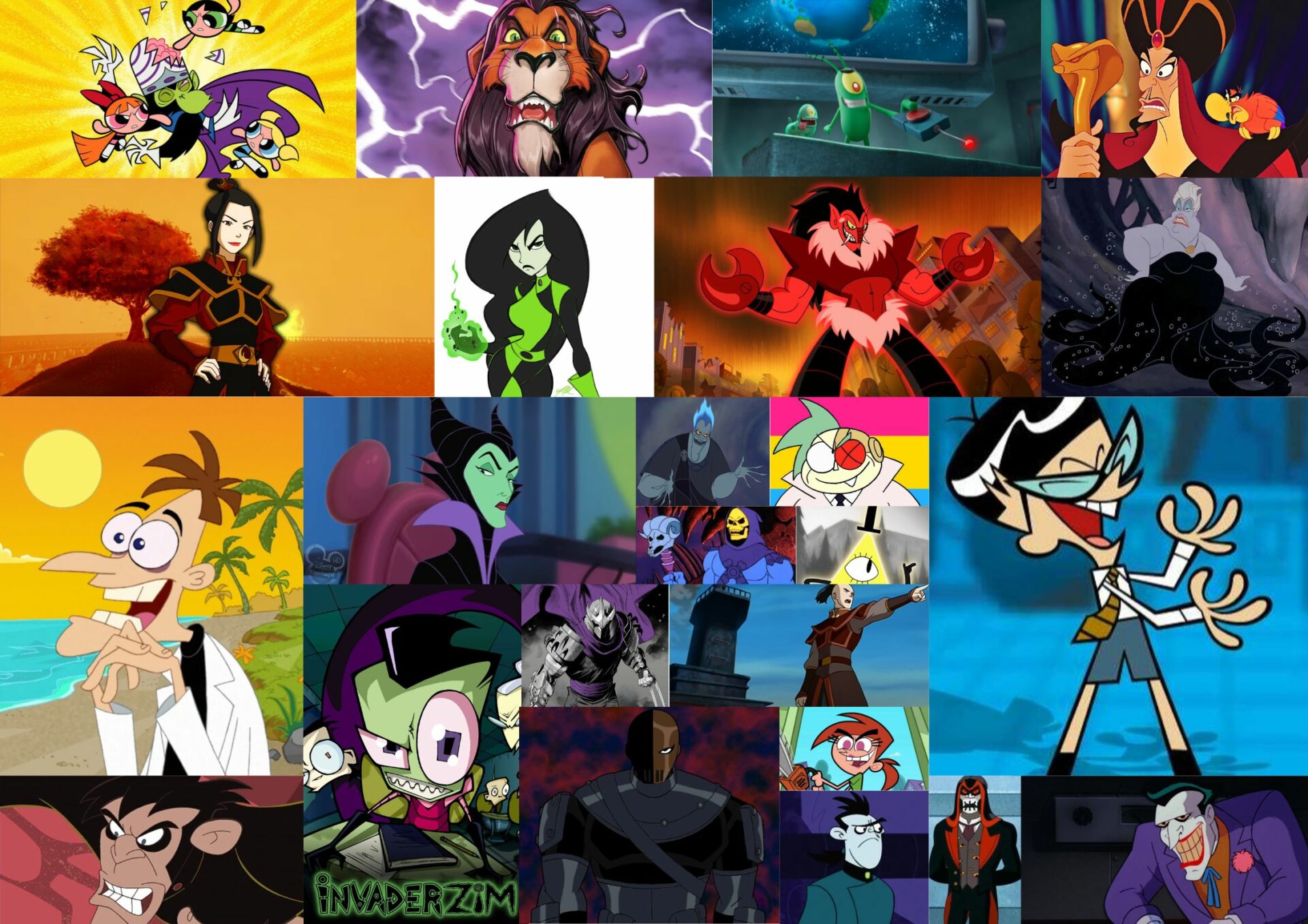
July 20, 2025 .
Animation, Lists
Our list rounds up the top 30 cartoon characters that were villains, each one more wonderfully wicked than the last.
READ MORE
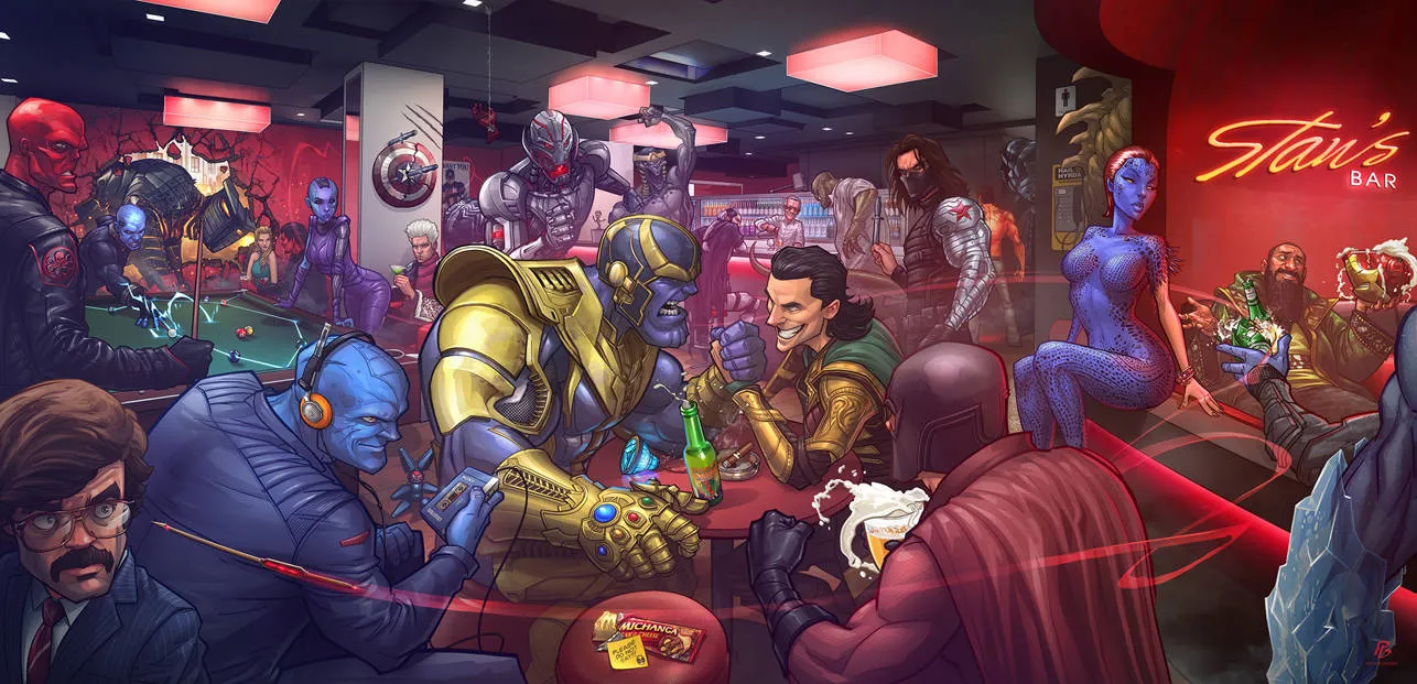
October 28, 2025 .
Lists, Marvel, MCU, Opinions
Let’s go through a list of the top 7 strongest Marvel villains, from the wickedly powerful to the absolutely unstoppable.
READ MORE
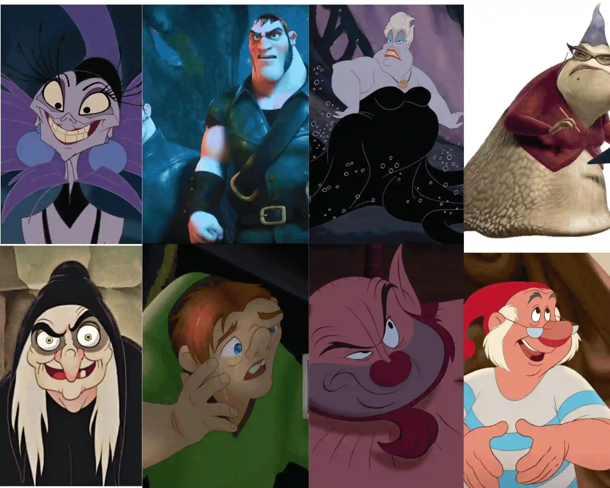
April 29, 2026 .
Lists, Opinions
The Mouse is famous for its princesses and princes. However, the studio’s true genius lies in its embrace of “ugly Disney characters”.
READ MORE
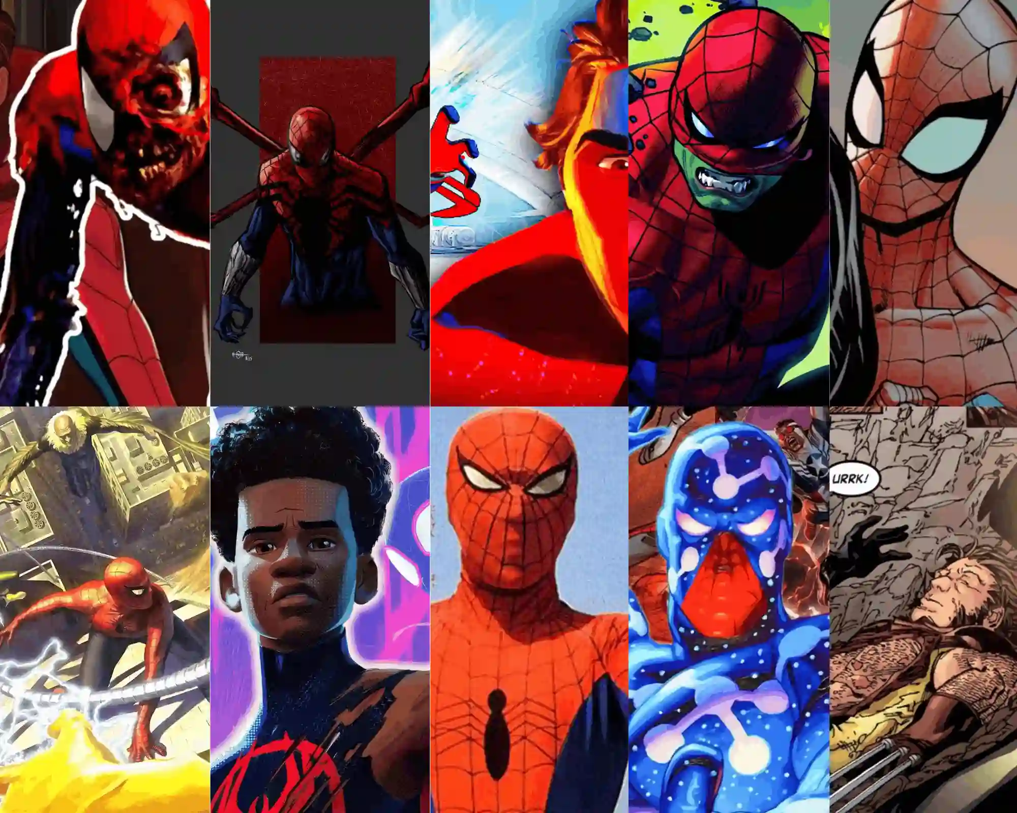
May 6, 2026 .
Lists, MCU
Spider-Man is one of the many superheroes from the Marvel Universe whose stories shaped many childhoods. Who is your strongest Spiderman?
READ MORE

November 27, 2025 .
Lists, Mythology
While this isn’t an exhaustive list, it comprises some of the most popular mythical creatures from around the world.
READ MORE

July 20, 2025 .
Opinions
Book recommendations from random places don’t always cut it, and you often end up feeling unsatisfied with them.
READ MORE

July 20, 2025 .
Essays, Opinions
READ MORE

July 20, 2025 .
Essays, Opinions
READ MORE

September 11, 2026 .
Opinions
Book reviews aren’t just a jumble of words on how a book made you feel but also a veritable document that you can quickly refer to when your memories temporarily fail you.
READ MORE

July 20, 2025 .
Opinions
Reading hundreds of pages for a single book can be like facing Smaug, Chiefest of Calamities, but a short story is a small dragon that you can easily conquer.
READ MORE

July 20, 2025 .
Debates, Opinions
Reading nonfiction about what interests you can provide more color and context that might make your fiction reading experience more enjoyable.
READ MORE
September 12, 2025 .
Opinions
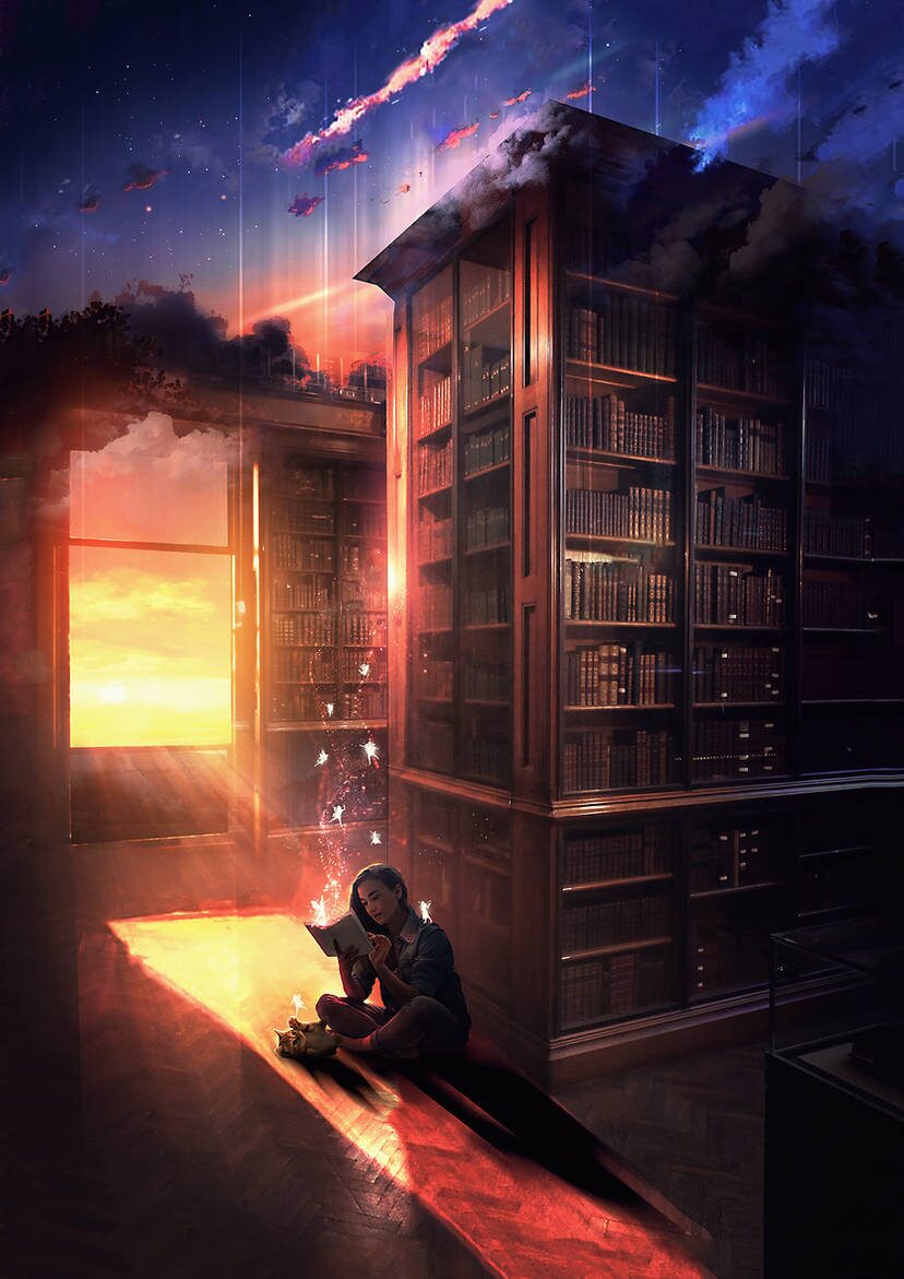
In a fast-paced world, reading asks us to slow down, surrender, and sit with another person’s words long enough for them to settle inside us.
READ MORE

November 24, 2025 .
Debates, Opinions
Reading is active while watching movies is passive. The act of turning pages creates a pause that enhances understanding.
READ MORE
July 26, 2025 .
Fantasy, Opinions
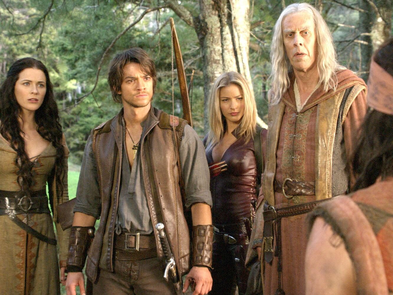
It’s cliche. But it’s rapid. It’s predictable. But it’s enjoyable. For lovers of the classic tropes, Legend of the Seeker is a worthy watch.
READ MORE
Get our magazine for free!